For more concept sheets in the Tools in Geography unit, go to the See also section.
There are many tools used when studying geography. They provide valuable information that can help you better understand the units you are working on.
Maps are very useful in geography, as they illustrate the characteristics of a territory. A map can show a small area, such as a city or even a neighbourhood. It can also represent something much bigger, like a continent or even the world.
The information on a map varies according to its type.
Some elements are found on all maps, regardless of type. These elements are useful when interpreting a map:
-
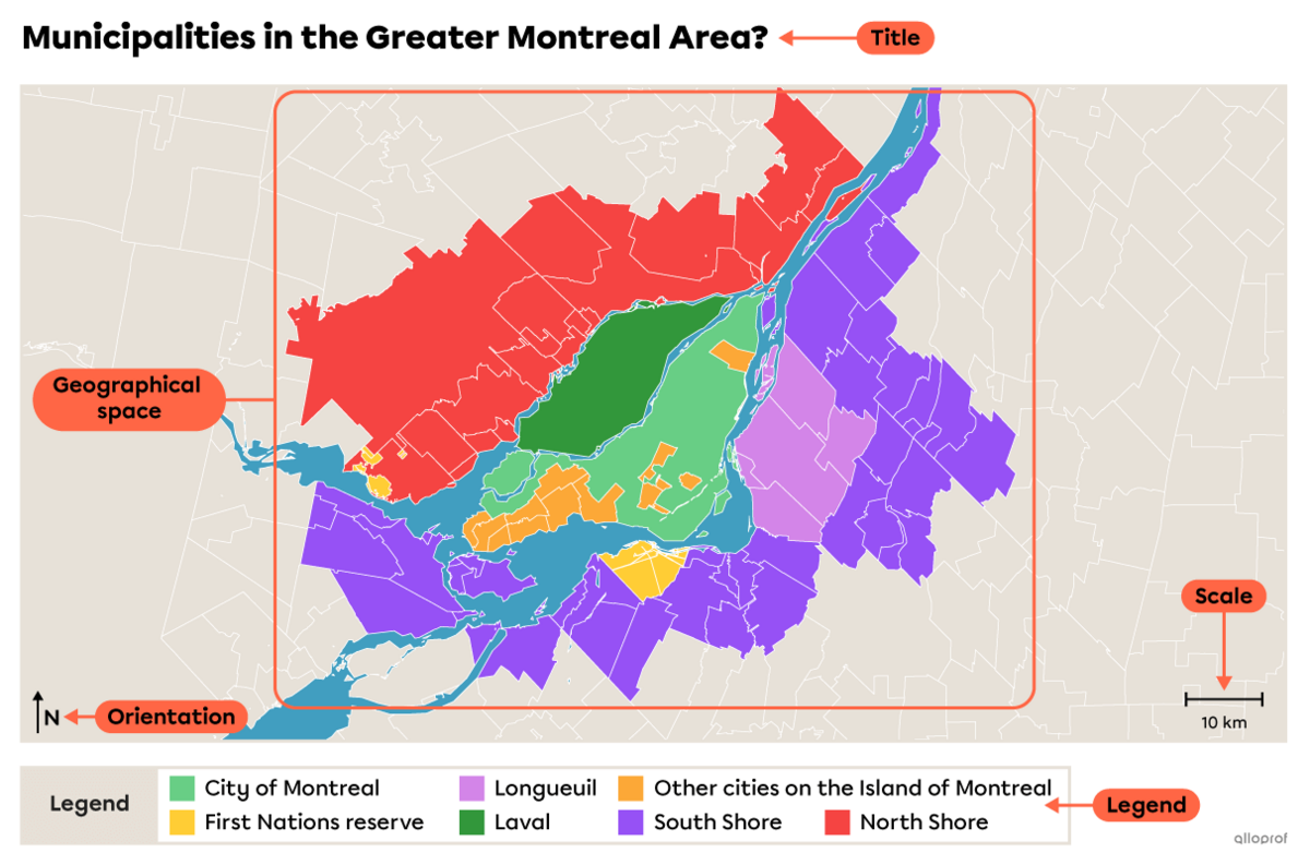
Title
-
Orientation and scale
-
Geographical space
-
Signs and symbols of the legend
Here are the steps to follow to correctly interpret a map.
-
Read the title.
-
It provides information about the subject of the map and the territory that’s represented.
-
Look at the map’s orientation and scale.
-
Orientation is represented by a compass rose and the scale shows the size of the area on the map.
-
Identify the geographical space represented on the map.
-
What territory do you see on the map? Is it a continent, country, region, city, etc.
-
Look at the legend.
-
Study the symbols and signs in the legend, then locate them on the map.
-
Interpret the information on the map.
-
After observing the different elements on the map, you will be able to interpret the information presented on it.
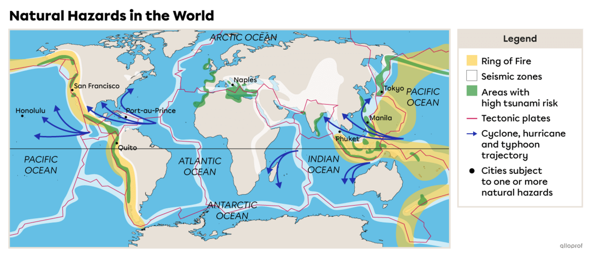
What information can be gathered from this map on natural hazards?
-
The title of the map tells us that the subject is natural hazards and that the territory shown on the map is the world.
-
The orientation tells us that north is at the top and that the scale has a value of 2500 km.
-
The geographical space represented on the map is the world. We know this because it’s written in the title and you can see all the continents on the map.
-
The legend provides a lot of useful information. When you analyze it, you can see that:
-
the Ring of Fire is shown in yellow
-
seismic zones are shown in white
-
areas with high tsunami risk are shown in green
-
the tectonic plate borders are outlined in red
-
cyclone trajectories are indicated by blue arrows
-
black dots represent cities that are subject to one or more natural hazards
-
After analyzing the legend and the map, we can make several observations about the information that’s presented.
-
Most seismic zones run along a tectonic plate boundary.
-
Areas with high tsunami risk are located close to seismic zones.
-
The Ring of Fire is located around the Pacific Ocean.
-
Cyclone trajectories are found in waters near the Equator.
-
Most of the cities identified on the map are subject to more than one natural hazard.
In geography, a landscape is presented through a photograph. A landscape can be made up of buildings, fields, roads, rivers, mountains, and more. To fully understand and explain what the landscape shows, you need to observe all its elements. Here’s a 4-step method to do so.
-
Determine the location of the landscape. There are several clues that can help. Pay attention not only to what you see in the image, but also to the accompanying title, text, and source.
-
Determine what you are looking for by analyzing the landscape. In other words, what’s your goal? Depending on what you’re looking for, you will observe different elements.
-
Look at all the elements in the picture and identify which are natural and which were made by humans.
-
Identify the information in the landscape that’s relevant to your goal. How is the area organized? What do you see?
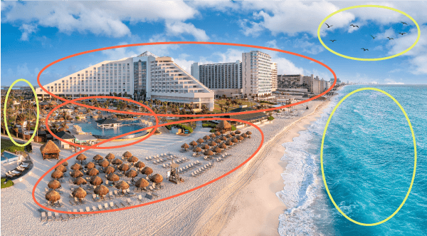
Knowing that the subject being studied is the planning and development of a tourist area, what are the important elements of this landscape? How could this be interpreted?

Mexico welcomes millions of tourists every year. The city of Cancún is a popular destination for travellers.
Source : jdross75, Shutterstock.com
-
The goal is to identify planning and developments related to tourism.
-
The title allows you to situate the landscape. It tells us that the landscape is in the city of Cancún, Mexico.
-
By looking at the image, you can identify several elements. Natural elements (in yellow) include the ocean, the beach, birds, and a few trees. Human-made elements (in orange) include buildings (hotels), a swimming pool, lounge chairs, and umbrellas.
-
A number of developments have been made near and on the beach to welcome tourists, including the addition of lounge chairs and umbrellas. Hotels provide accommodation.
Mexico welcomes millions of tourists every year. The city of Cancún is a popular destination for travellers.
Source : Adapted from jdross75, Shutterstock.com
A visual document, also known as an iconographic document, can be a painting, photograph, engraving, drawing, or caricature. In short, it’s an image.
Here are the 6 steps to extract relevant information from a visual document.
-
Read the title and caption.
-
What do they tell you about the visual document?
-
Identify the nature of the document.
-
Is the visual document a photograph, a drawing, or a caricature? By identifying the nature of the document, you can determine whether it represents reality (like a photograph) or an interpretation of an event or place (like an illustration or caricature).
-
Find the source and date.
-
These will tell you who created the document and when the document was produced.
-
Determine the subject.
-
What is the subject of the document? What was the creator’s intention in creating it (to show reality or to share a personal vision)?
-
Gather information about the location, the people, and the circumstances.
-
By looking at the document, you can determine the place depicted, the activities that take place there, the people involved, the developments in the area, etc.
-
Identify what is the most relevant.
-
What useful information does the document give you for analyzing the region?
When studying the issues that affect a metropolis, what information can you extract from this visual document?
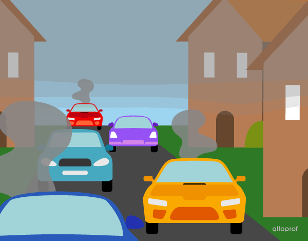
Every day, many cars are driven from the suburbs to downtown.
Source : Alloprof, 2023.
-
The title and caption indicate that the subject is transportation isssues in suburbs and metropolises.
-
The document is an illustration.
-
The source identifies Alloprof as the document’s author and 2023 as the date of production.
-
The subject of the document is related to travel in metropolises.
-
The illustration shows several cars on the same road. All around, there are houses and grey clouds in the air.
-
The document shows several cars travelling in a suburb. The grey clouds represent the high level of air pollution caused by these cars. The illustration shows a consequences of heavy traffic in a metropolis.
A written document can take several forms:
-
A newspaper article
-
A letter
-
A contract
-
A brochure
-
Etc.
A text contains a great deal of information. The 5W method is very useful to help you find it. By asking yourself the who, what, where, when, and why questions, you’ll be able to extract the key information.
For more information on this method, consult the concept sheet Document Analysis: The 5W and the 5W+H.
When studying issues affecting heritage cities, what information can you extract from this written document?
“UNESCO manages several heritage lists, including one for heritage sites that are in danger. These sites are at risk of serious deterioration or of disappearing altogether. UNESCO created this list to highlight the risk to these sites so that, ideally, they can be better conserved and can receive more assistance to protect them. In 2021, there were 36 cultural heritage sites on the List of World Heritage in Danger.”[2]
Source : Alloprof, Issues Affecting Heritage Cities, (n.d.)[1]
Using the 5W method helps you find the key information in the text.
“UNESCO manages several heritage lists, including one for heritage sites that are in danger. These sites are at risk of serious deterioration or of disappearing altogether. UNESCO created this list to highlight the risk to these sites so that, ideally, they can be better conserved and can receive more assistance to protect them. In 2021, there were 36 cultural heritage sites on the List of World Heritage in Danger.”[2]
Source : Alloprof, Issues Affecting Heritage Cities, (n.d.)[1]
Who?
The Who? is UNESCO (United Nations Educational, Scientific and Cultural Organization). Some clues help you find the Who?. Clues are in blue in the text. Careful, even if Alloprof is the author of this text, they are not the Who?.
What?
The text is about endangered heritage sites around the world and the World Heritage List in Danger. The clues are highlighted in green in the text.
When?
The text gives a clue about the time. Thanks to this clue, we know that the excerpt is recent, even if we don’t have a specific date. The time clue is in red in the text.
Where?
The text gives little information about the place in question. The only clue suggests that the location is very large, all over the globe. The clue is in purple in the text.
Why?
The Why? explains the What?. The text gives a clue as to why the World Heritage List in Danger was created. The clue is in pink in the text.
There are several ways to interpret a written document. Here is another one, in 8 steps.
-
Read the title.
-
The title often indicates the subject of the document. It can also give you an idea of the author’s intention.
-
Find the author’s name and profession.
-
Is the author a journalist? A geographer? A political figure?
-
Determine the nature of the document.
-
Is it an opinion piece or an information piece? Understanding the nature of the text will help you better judge the information it contains.
-
Identify the source.
-
The source gives you several key pieces of information, including the source’s reliability. For example, sources from a government or an academic researcher tend to be reliable.
-
Identify the central topic.
-
What is the document about? The document’s title often provides a good clue as to the subject, but a full read through is needed to confirm this.
-
Identify the main ideas.
-
Once you have identified the central topic, identify the main ideas that go with it. Main ideas are often structured as paragraphs, so that is a good place to start.
-
Summarize the text.
-
Outline the subject and main ideas in a short text summary.
-
Compare the information with other sources (if necessary).
-
Comparing the content of a document with other documents allows you to validate information or check whether an author’s opinion is shared by others.
Tables are used to organize and present data in a clear and concise way.
To properly interpret the information in a table, there are four steps to follow.
-
Read the title.
-
This tells you the subject of the table.
-
Read the column and row headings.
-
They often give clues about the units of measurement used.
-
Determine the nature of the information.
-
What type of information is in the table? Is it quantitative or qualitative data?
-
Interpret the table.
-
Using the information you now have, what information and conclusions can you draw from the table?
| Category |
Wind speed (km/h) |
Possible damage |
|---|---|---|
|
F0 |
104 to 137 km/h |
|
|
F1 |
138 to 177 km/h |
|
|
F2 |
178 to 217 km/h |
|
|
F3 |
218 to 266 km/h |
|
|
F4 |
267 to 322 km/h |
|
|
F5 |
322 km/h and over |
|
SSource of the data: The Weather Channel, 2020[2]. |
||
-
The title tells you that the subject of the table is the enhanced Fujita scale (a scale used to categorize tornadoes).
-
The column headings tell you that the table lists the tornado categories, wind speed, and possible damage.
-
Each tornado category has quantitative data (wind speed expressed in km/h) and qualitative data (description of possible damage).
-
Using the information in the table, you can analyze each category of tornado in terms of its wind speed and potential damage.
-
For example, you can see that a category F0 tornado has wind speeds of 104 to 137 km/h and can cause some damage to trees, windows, and so on.
-
A category F5 tornado, on the other hand, has wind speeds of 322 km/h or over and the potential damage is much greater, such as houses ripped from their foundations and buildings being completely destroyed.
Graphs are very useful for presenting data in a visual way. There are different types of graphs, depending on the data used. Here are the main ones.
Here is a 4-step method for interpreting any type of graph.
-
Identify its type.
-
Is is a bar graph? A pie chart?
-
Read the title and legend.
-
What is the graph’s subject? What is it about? What information is provided in the legend?
-
Look at the axes (x and y).
-
What information do they give about the unit(s) of measurement used and the categories presented?
-
Compare the data collected and interpret the graph.
What information can you find by interpreting this graph?
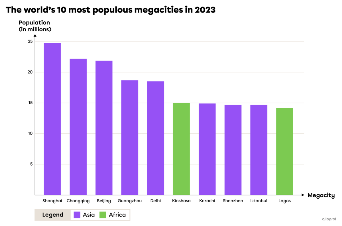
Source : WorldData, (n.d.)[3]
-
The graph is a vertical bar graph.
-
The title indicates that the subject of the graph is megacities and their populations. The legend specifies the continent on which each megacity is located.
-
The axes compare each megacity with its population (calculated in millions).
-
By comparing the data, we can see that all the megacities have more than 14 million inhabitants. The most populous megacity has almost 25 million inhabitants. Furthermore, all the megacities are located in Asia (the majority) or in Africa. Of the 10 most populous megacities, none are located on other continents.
To access the rest of the unit, please consult the Tools in Geography concept sheet.
- Alloprof. (n.d.). Issues Affecting Heritage Cities. https://www.alloprof.qc.ca/en/students/vl/geography/issues-affecting-heritage-cities-g1018
- The Weather Channel. (2020, april 9th) The Enhanced Fujita Scale: How Tornadoes are Rated. https://weather.com/storms/tornado/news/enhanced-fujita-scale-20130206
- WorldData. (n.d.). Mégapoles. https://www.worlddata.info/megacities.php