This section shows the structure of a graph in a lab report. However, the content required may vary depending on the preferred teaching method or the grade level of the student.
A graph is a tool that provides a graphic representation of results obtained experimentally.
When drawing a graph, it is important to keep the following elements in mind.
-
Graphs should be presented in a logical order. The initial data should be shown in an initial graph, while the data calculated from the original data should be displayed after any initial graphs.
-
Graphs should be constructed with a ruler. The use of electronic tools (Excel, Word, Geogebra) simplifies the creation of tables. If the graph is to be constructed manually, it is better to use millimetre paper rather than graph paper or lined paper.
-
Each graph must be numbered and identified with a title. The title must be meaningful and indicate what the reader will see in the graph. It is best to avoid using titles such as "Graph of Experiment", as these titles give no relevant indication regarding the content of the graph. If in doubt, both axes can be used to create the title so as to describe the dependent variable in relation to the independent variable.
-
Each axis of the graph must be correctly identified by a title with the variable, units of measurement in parentheses (if applicable), and absolute uncertainty (if necessary).
-
The horizontal axis (axis of abscissas, or |x|-axis) is used to represent the independent variable, while the vertical axis (axis of ordinates, or |y|-axis) is used to represent the dependent variable.
-
The scaling of the axes must be done so that the graph occupies more than |50%| of the page. Therefore, it is important to ensure that the axes allow for the representation of all the experimental data, and that these data are spread fairly over most of the page. If necessary, it may be important to use an axis break to get a better picture of the data.
Graphs can be produced from two different sources.
To create a graph properly, there are a few essential steps to follow.
-
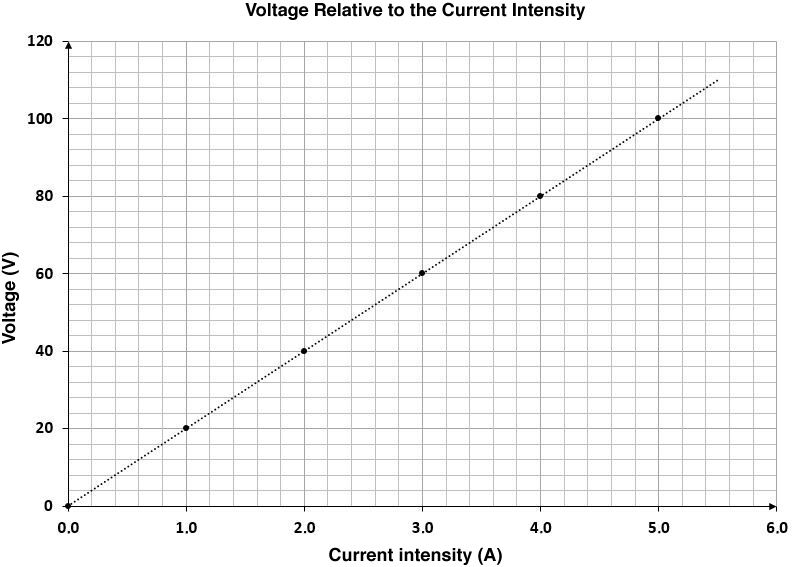
At the top of the graph, there should be a title referring to the relationship between the two variables identified on the axes of the graph. For example, in this graph, the relationship between voltage and current intensity will be shown. The title will describe the relationship between these two variables.
-
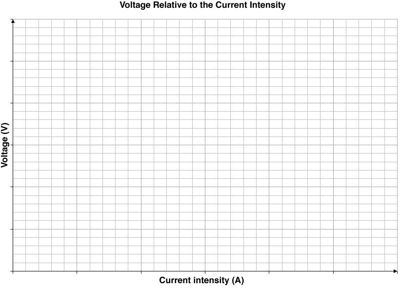
The axes must then be identified. An axis is always drawn using a ruler and usually ends with an arrowhead. The two axes of a graph must be identified using the unit of measurement associated with the variable sketched. The units are placed in parentheses below the symbol.
-
The axes must then be scaled. To graduate the axes of a handmade graph, it is recommended to calculate the number of squares and divide it by the largest data to find out what the scale value will be.
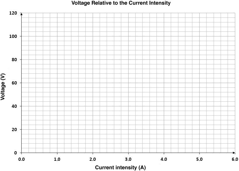
It is not necessary to indicate the scale values for each grid space. Since the graph should be easy to interpret, the scales should not be overloaded with numbers. Therefore, it is preferable to write down the value of the axes for every two, five, or ten spaces.
Sometimes, the extent of the data obtained causes a problem when matching with the axis. In these cases, it is better to make an axis break. This is done by drawing two small oblique lines (//) directly on the axis, between the origin and the first scale on the axis.
-
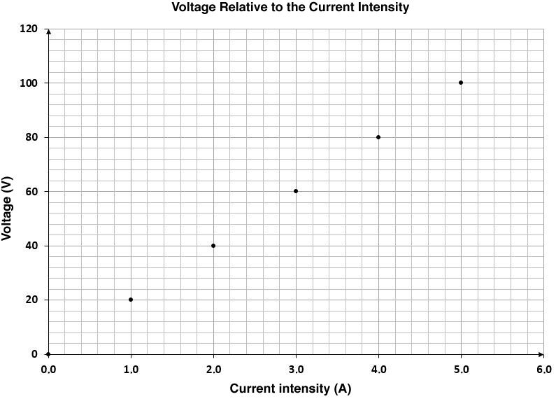
The experimental data must then be plotted in the graph. Make sure to put the values in the right places according to the values on the axes.
-
Finally, when all the points have been drawn, simply draw the curve or the line. In the case of a linear relation, we will observe points aligned along a straight line. The line passing closest to all the points must be drawn using a ruler. If possible, the line should pass through all the points. In the case of a curve, a regular plot is made that runs as close as possible to all the points.
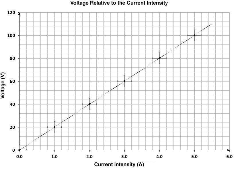
To plot uncertainties on a graph, lines must be drawn on either side of the point of a length equivalent to the uncertainty. Thus, the lines on either side of the horizontal point will represent the uncertainty of the independent variable, while the vertical lines will represent the uncertainty of the dependent variable.
In some cases, graphs are produced using specialized equipment to collect and record data. Such equipment may include seismographs, electrocardiograms, or spark timers. When graphs generated through the use of this type of equipment must be submitted in a lab report, always ensure that certain standards are met.
-
Assign a title to the graph in the centre, on the upper edge of the paper.
-
If needed, identify each plot with a short description. If space permits, insert this description to the far left of the plot.
-
If necessary, indicate the units in brackets below the plot.
-
Identify on the graph certain parameters such as the voltage used in the experiment or the speed of unwinding of the paper. Be careful! Do not interfere with the visibility of the tracings.
-
Use lines to indicate the beginning and the end of an experiment if necessary.
