Content code
m1682
Slug (identifier)
the-circle-graph-elementary
Parent content
Grades
Grade 5
Grade 6
Equivalent file in the opposite grade group
Topic
Mathematics
Content
Title (level 2)
Grades 5 and 6
Title slug (identifier)
fifth-and-sixth-grade
Contenu
Contenu
Title
What Is a Circle Graph?
Content
Corps

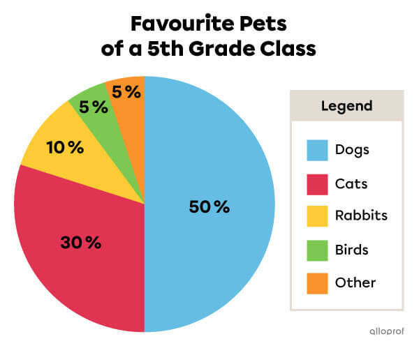
A circle graph represents a whole that is divided into parts or into sectors.

Content
Corps

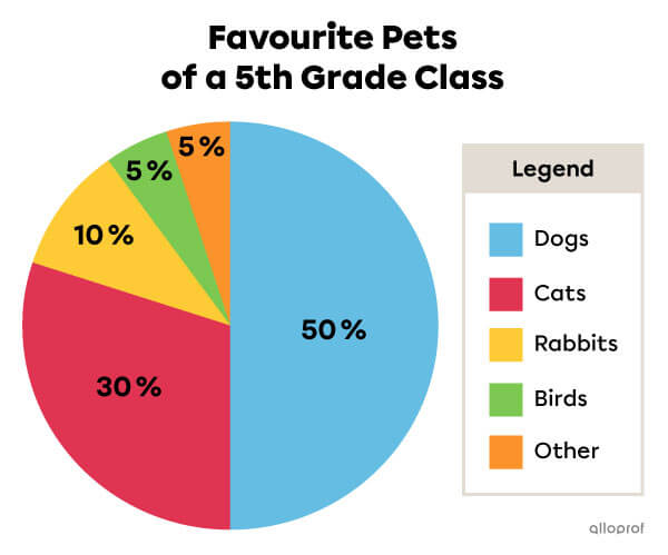
The circle represents the whole, which is the total number of students in a 5th grade class. The different sectors represent the percentage of students who prefer a specific pet.
Image
Circle graph example.
Title
What Are the Parts of a Circle Graph?
Content
Corps

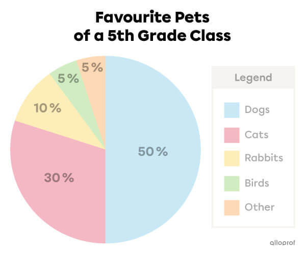
A circle graph always has a title that introduces the subject of the survey.

Content
Corps

The title indicates that this circle graph represents the favourite pets of the students in a class of 5th grade.
Image
Example of a circle graph title.
Corps

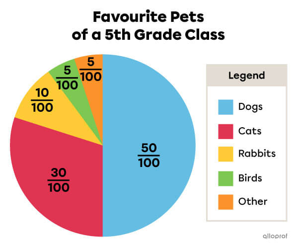
A circle graph is separated into sectors. Sectors are the parts of the circle defined by |2| radii. Each sector corresponds to the data collected and is associated to a category in a legend. The data is expressed as a percentage (%) or as a fraction.

Content
Corps

The red sector, the one that represents the students who prefer cats, is |30\ \%| of the class |(100\ \%).|

The red sector represents |\dfrac{30}{100}| of the class |\left(\dfrac{100}{100}\right).|

Example of a circle graph. Example of a circle graph.
Corps

The size of each sector varies according to the part of the whole represented. So, the larger the amount of data represented, the larger the sector will be.

Content
Corps

Since the percentage of the yellow sector is higher than the percentage of the green sector, the yellow sector is bigger.

Image
Example of different sector sizes in a circle graph.
Corps

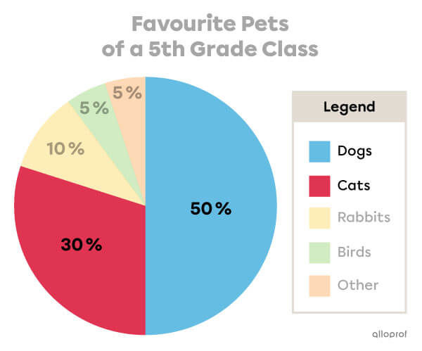
A circle graph has a legend that specifies what each sector represents.

Content
Corps

The legend indicates that the blue sector represents the percentage of students whose favourite pet is a dog. The red sector represents the percentage of students whose favourite pet is a cat.
Image
Example of a circle graph legend
Title
How Do We Interpret a Circle Graph?
Content
Corps

To interpret a circle graph, you need to analyze all parts of the graph while keeping the survey question in mind.

Content
Corps

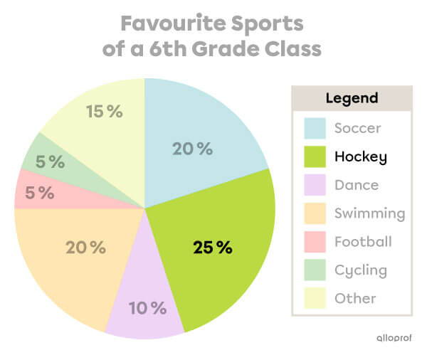
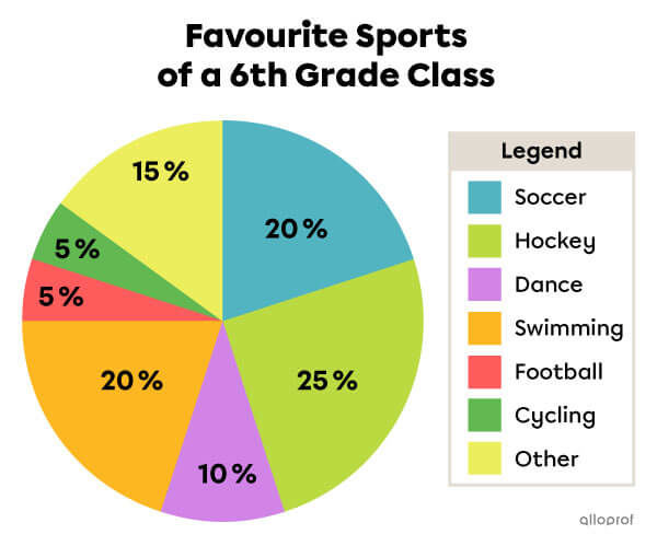
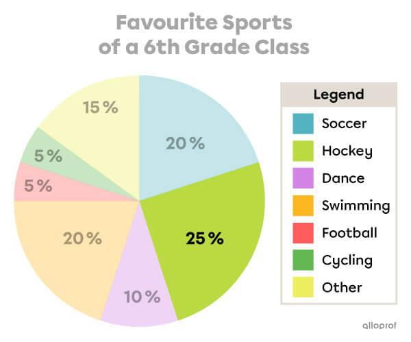
What is the preferred sport among students in this 6th grade class?
Image
Example of how to interpret a circle graph.
Corps
  1. I look at the sectors of the circle and the associated percentages to identify the biggest one.

    The light green sector represents the largest portion of the data at |25\ \%.|

Example of how to interpret a circle graph.

  1. Then, I look at the legend to find out which sport it represents.

    The legend indicates that the light green sector corresponds to students whose favourite sport is hockey.

Example of how to interpret a circle graph.

Hockey is the most popular sport among the students in this 6th grade class.

Content
Corps

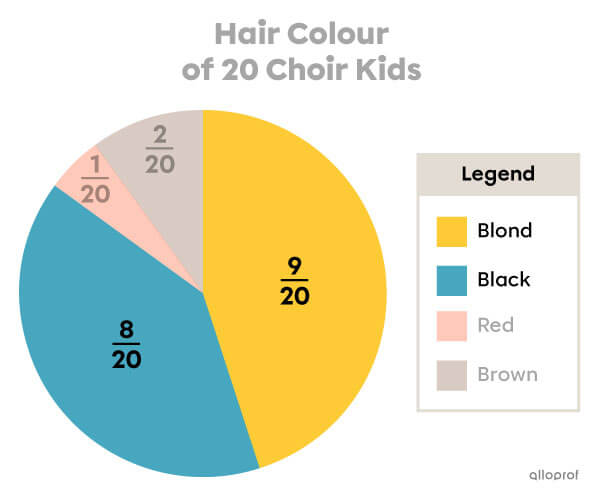
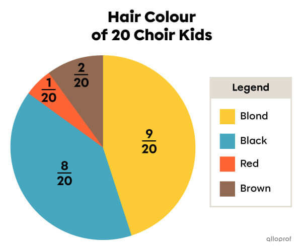
Are there more children in the choir with brown or blond hair?
Image
Example of how to interpret a circle graph with fractions.
Corps
  1. Using the legend, I take note of the sectors that represent children with blond and black hair.

    The yellow sector represents children who have blond hair.

    The blue sector represents children with black hair.

Example of how to interpret a circle graph with fractions.
  1. I look at the data in the yellow sector (blonde hair) and the data in the blue sector (blackhair).

    The yellow sector represents |\dfrac{9}{20}.| So, 9 out of 20 children have blond hair.

    The blue sector represents |\dfrac{8}{20}.| So, 8 out of 20 children have black hair.

Example of how to interpret a circle graph with fractions.

More children have blond hair.

Content
Corps

Fractions in a circle graph can have different denominators. To find out how to compare them, see the Comparing and ordering fractions concept sheet.

Title
How Do We Find Missing Data in a Circle Graph?
Content
Content
Corps

Remember that the sum of the percentages represented in a circle graph is always |100\ \%.|

Example:

Image
Example of a circle graph showing that the sum of the sectors is 100%.
Corps

When I add the percentages in this circle graph, the sum is |100\ \%.|
|22\ \%+ 43\ \%+12\ \%+23\ \%=100\ \%|

Corps

To find missing data, you must subtract the sum of the known data
from |100\ \%|.

Content
Corps

Find the missing data in the circle graph to identify the percentage of students who prefer milk.

Image
Example of a circle graph with missing data.
Corps
  1. I add the known data.

|53\ \%+ 3\ \%+ 25\ \%=81\ \%|

  1. Then, I subtract the total of the known data from |100\ \%|.

|100\ \%-81\ \%=19\ \%|

The missing data is |19\ \%.| So, |19\ \%| of the day camp kids prefer milk.
Contenu
Title
See Also
Content
Links
Remove audio playback
No