Statistical studies are used to collect data. When the data forms a 2-variable distribution, they can be represented in a double entry table or on a Cartesian plane. The graphical representation of the data is called a scatter plot.
A scatter plot is a graph that represents each pair of a 2-variable quantitative distribution.
If there is a dependency between the studied variables, the independent variable is placed on the |(x)|-axis and the dependent variable on the |(y)|-axis.
A scatter plot is used to visually represent the different results obtained from a statistical survey. Therefore, the points should not be connected to form a straight line or curve of any kind. However, it is sometimes possible to associate a scatter plot with a mathematical model (linear, exponential, polynomial, etc.). This is called modelling. The scatter plot may appear to form a straight line or a curve that can be associated with a known function.
To begin, here is how to make a scatter plot.
In one school, a survey was carried out to learn about the video game habits of young people. For one game in particular, the time taken to complete a game and the number of games played were examined. Here is a table presenting the collected results:
| Duration of the game (min) |
Number of games played | Duration of the game (min) |
Number of games played | Duration of the game (min) |
Number of games played |
|---|---|---|---|---|---|
| |12| | |2| | |8| | |3| | |12| | |2| |
| |7| | |5| | |11| | |4| | |7| | |6| |
| |10| | |3| | |10| | |3| | |9| | |4| |
| |12| | |3| | |8| | |4| | |11| | |3| |
| |9| | |3| | |9| | |3| | |7| | |8| |
| |8| | |3| | |12| | |1| | |9| | |4| |
Using this data, construct a scatter plot for this survey.
-
List the coordinates of the data pairs of the scatter plot.
In this example, a point must be placed at each of the following coordinates:
|(12, 2),| |(7, 5),| |(10, 3),| |(12, 3),| |(9, 3),| |(8, 3),| |(11, 4),| |(8, 4),| |(12, 1),| |(7, 6),| |(9, 4),| |(11, 3),| |(7, 8)|
In fact, each of these coordinates represents an answer from one individual of the sample or population.
-
Plot these points on a Cartesian plane
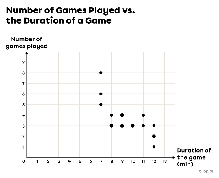
Note: The scatter plot can be a bit misleading since, if the same pair of data values occurs several times, there is still only one point that appears on the graph. In the example above, the pair |(9,4)| repeats 2 times, but only one point is shown with the coordinates |(9,4).| It is possible to magnify a repeating point, but it does not tell you how many times it repeats. Also, this convention is not followed everywhere.
In the previous example, we can see a trend in the scatter plot. We can see that as the time of a game increases, the number of games played decreases. We can therefore say that there is a correlation between the 2 variables. The strength of this correlation can be calculated using the correlation coefficient. This can also be modelled using a regression line or a curve. The goal is to find the model that best fits the scatter plot.
A scatter plot based on a real situation rarely shows perfectly aligned points or points that form a perfect curve. Nevertheless, it is often possible to associate the scatter plot in question with a mathematical model, that is, with a function that is known and can be worked with.
A mathematical model is a representation of a complex phenomenon using known mathematical tools (functions, rules, graphs, etc.)
Modelling is the act of describing real, observed data with a mathematical model to analyze the data more easily and to make predictions.
A trend curve is a curve that models a given scatter plot. It is the curve that best fits the majority of the points.
Regression line is the name given to a tendency curve when it is a straight line.
Several functions serve as mathematical models for different scatter plots.
Scientists and statisticians are concerned with finding the best mathematical model for the data they collected. However, it is usually enough to associate scatter plots with linear functions (lines) or rational functions.
Here are most of the possible functions. Each function is classified according to whether it forms a line, a curve or another model.
When a scatter plot displays a linear trend, that is, the points seem to form a straight line, it can be modelled using one of the following functions:
The 0 Degree Polynomial Function
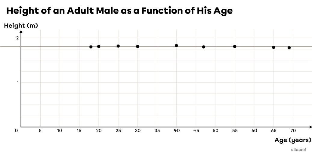
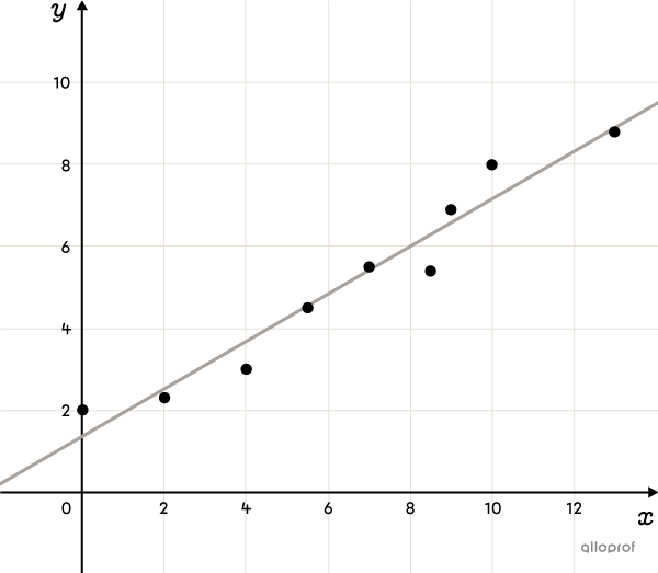
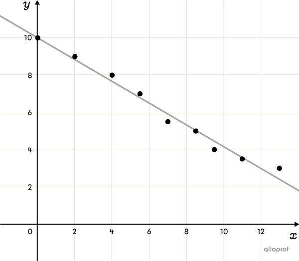
The line of best fit for a scatter plot is the regression line. Several methods exist to determine its rule, including the Mayer Line method and the Median-Median Line method.
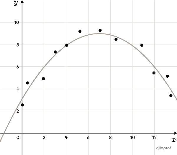
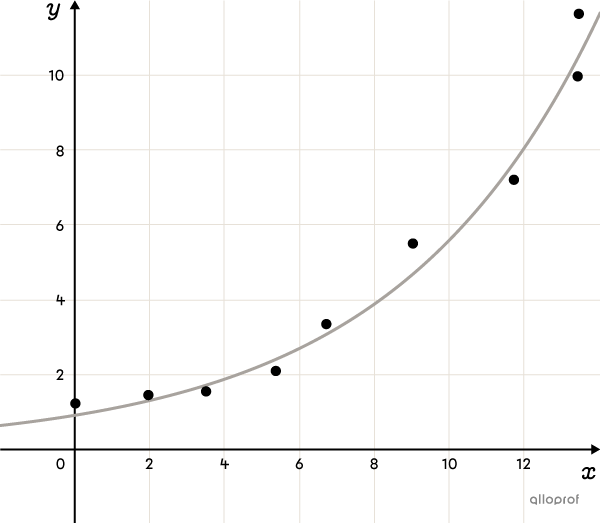
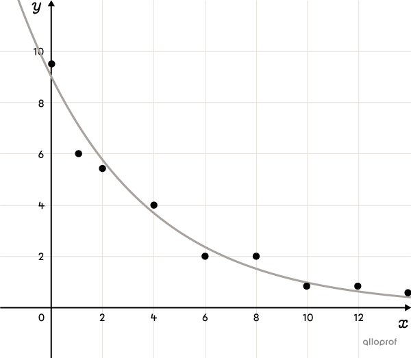
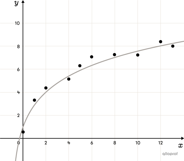
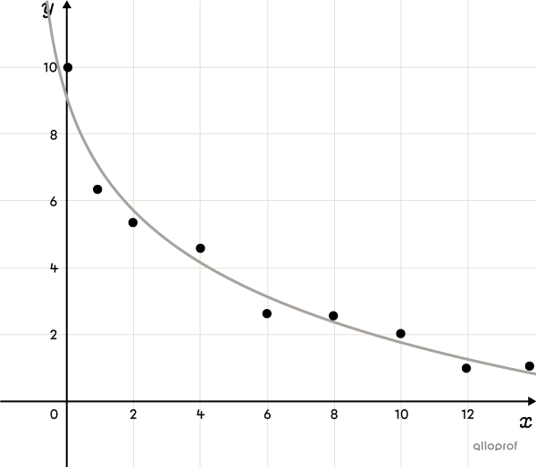
Here are some of the functions that can be used as mathematical models for scatter plots that resemble a curve. Sometimes, to determine the most appropriate model, you can rely on the context. For example, the number of bacteria in a sample as a function of time usually follows exponential growth. This is the model that should be chosen. In other situations, it is quite possible to use 2 different functions to model the data and get reliable predictions in both cases.
The Rational Function

The 2nd Degree Polynomial Function (advanced concept)
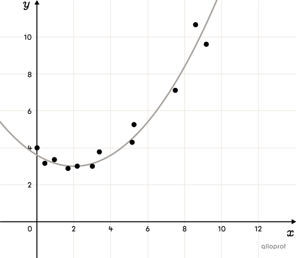
The Exponential Function (advanced concept)
The Logarithmic Function (advanced concept)
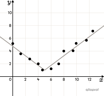
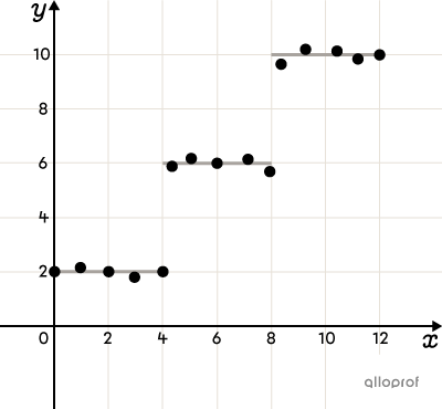
Piecewise Functions
Sometimes a scatter plot does not show a single trend, as there may be a break in the data caused by a variety of reasons. For example, a normal human being grows for the first 15 to 20 years of life and then stops growing in adulthood. The plot would therefore show growth at first and a constant function thereafter.

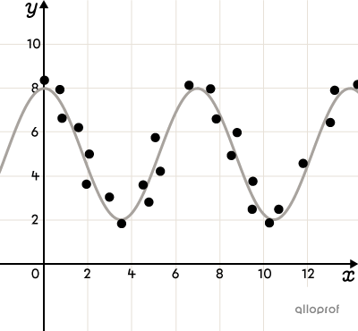
There are several other functions that can be used to model a scatter plot. Here are some of them:
